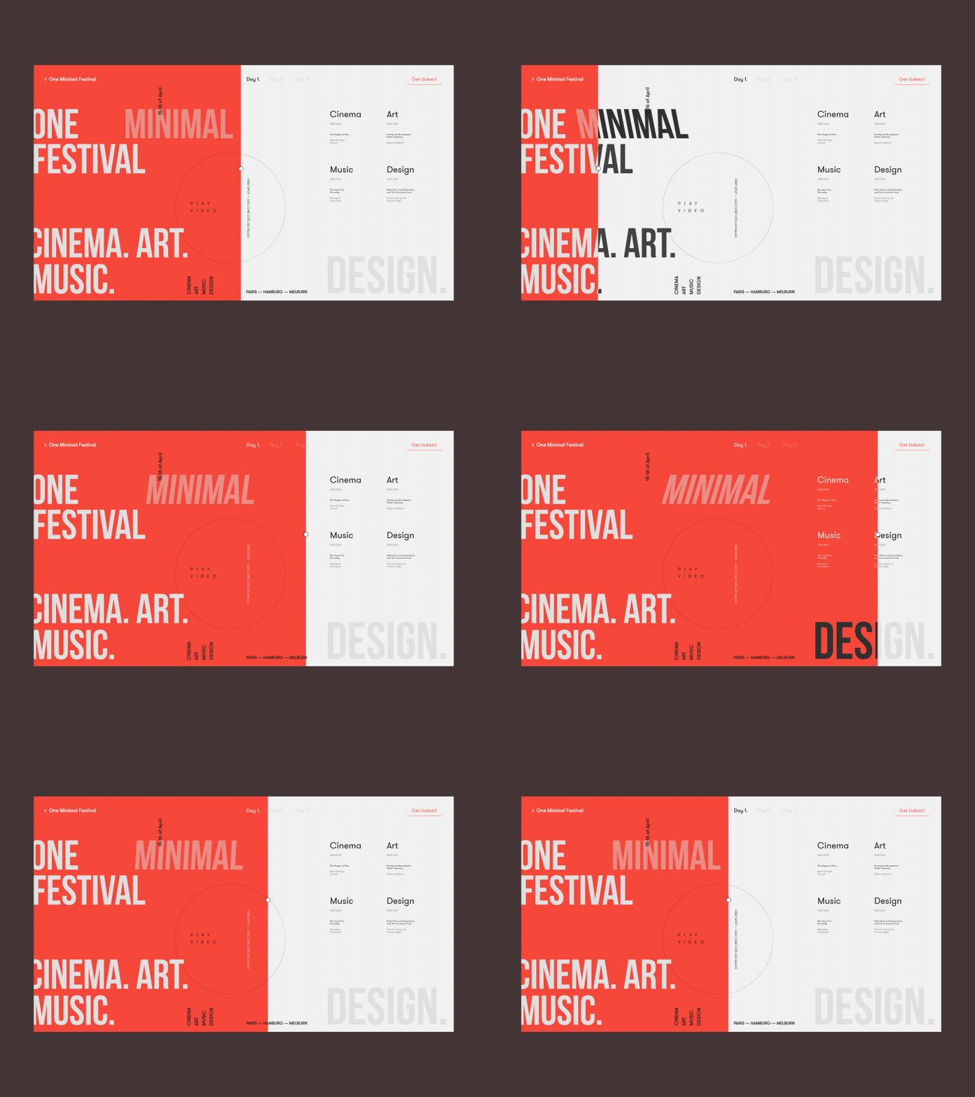
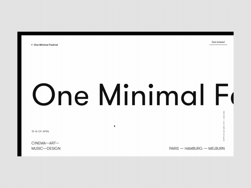
One Minimal Festival Homepage Alternative Version
Hey,
This is another homepage animation concept that I created for a pretty rad festival organized for creatives focused on such four areas as cinema, art, music and design. The idea was to live up to the name of the festival and keep the design and interactions very minimalistic yet memorable. There is a draggable line that evokes the interactions on the page.
How do you like this one?
Eager to hear your feedback!
Stay tuned for more :)
Cheers!
Press "L" to appreciate it
More by Synchronized View profile
Like

