Se Pro Bc
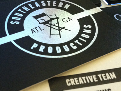
The circular shape was derived from a film reel canister. I think the curved type as well as the font chosen creates a California vibe. Rather than literally use an image of film, I represented it with the ribbon, which runs across the back of the card, and pops out where the name is placed. It has a foil stamp on the front.
More by Jeremey Pohl View profile
Like
