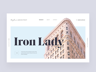
Architecture blog article hero layout
I've always been fond of the Flatiron Building. Wanted to take away its heavy domineering presence and present it in a way that makes it light and airy.
—
I experiment with grids, typography, hierarchy, colour, and white space. I post every Monday, Wednesday, Thursday.
—
🖤 Hit ‘L’ if you like what you see
💬 How can I visually improve this?
📎 Check out the attachment for full-size
🕶 Follow me to keep up with the Journey
—
Thanks for viewing!
—
Instagram / Website
More by Imran Ashraf View profile
Like

