Architecture Blog Article Layout
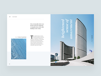

Experimenting with composition and colours. Tried to balance the elements on the left with the visual weight of the image on the right.
What do you think?
—
I experiment with grids, typography, hierarchy, colour, and white-space. I post every Monday, Wednesday, Thursday.
—
🖤 Hit ‘L’ if you like what you see
💬 Tell me how can I visually improve this
📎 Check out the attachment for full-size
🕶 Follow my profile to keep up with the Journey
—
Thanks for viewing!
—
Instagram / Website