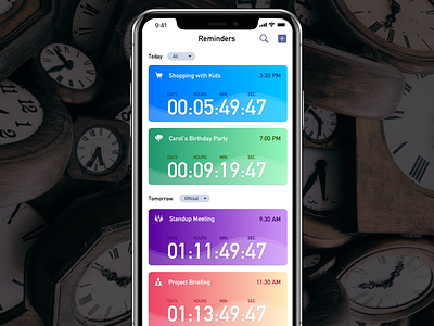
Reminder App Concept
Every morning when you look at your calendar app or reminders app it is given you info about your next event or task at this (Date & Time Stamp) and then your mind passively calculates the days and time when you would actually hit this event.
It is common practice to mention 'To Date' in (Date & Time Stamp) and then 'End Date' in (Date & Time Stamp) .
If you look deep into the actual user experience it involves, you will find that user actually passively calculates how much time is left. Some time by looking at the calendar, sometimes by looking at the clock. It means that in order to understand a particular time and date of an event, user has to seek help from few more apps.
I feel user actually wants to know how much Date & Time is the left to actually attend any meeting, event or complete any task.
I'm trying to given an idea by this Dribbble shot how the app could be at basic level.
https://blog.prototypr.io/ux-of-small-things-in-my-opinion-22a8efbabf90
I would love to hear from you and if you agree hit the 'L' key
