Education App
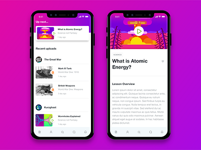
This weekend I've been back working on my Education App project, and have taken a look at how the home screen would look like for returning visitors, and how they progress in their courses.
Showing their 'Next Video' as a sticky element at the top will prompt the user to continue with their recent courses, keeping them in the preferred user flow.
Make sure to check out the Hi-Res attachments for the whole pages.
Find me on Instagram
More by Kevin Murphy View profile
Like


