Dakh. Hero page. Main screen of promo landing craft hygge brand
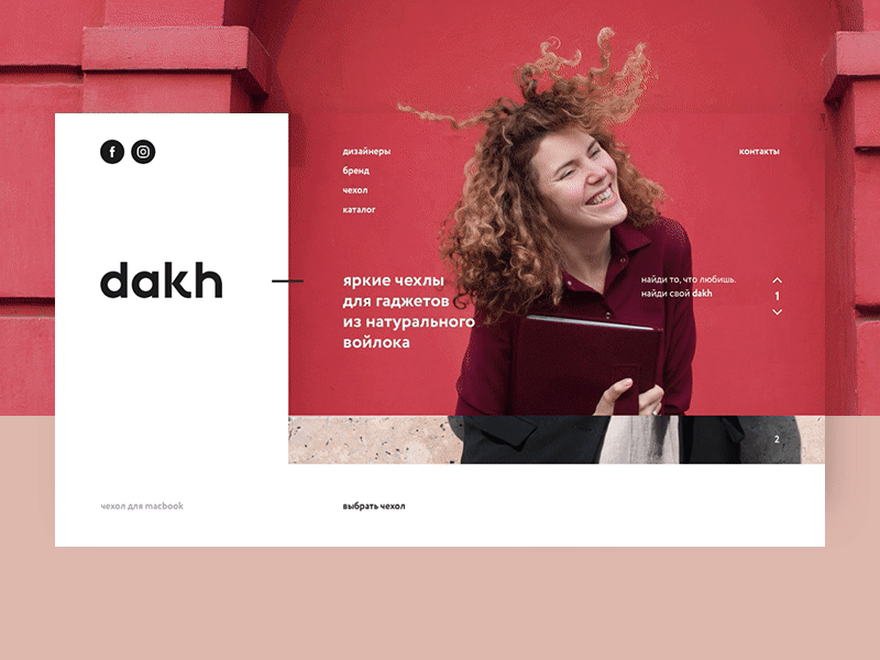
What? Dakh - bright covers for gadgets from natural felt. Comfortable covers for MacBook from natural felt, 100% of merino wool.
A task The contradiction that worries us: landing pages are characterized by a wow effect, and we have a mature, minimalist, conscious brand and it is important to convey this, but it's not boring.
Two function buttons: "See more" leads to instagram. "Choose a case" - leads to the store on the fb.
For 2 hours, as part of the design battle, from the moment I received the assignment, I made a design for a 6-screen lending.
For 2 hours, as part of the design battle, from the moment I received the assignment, I made a design for a 6-screen landing. Full version https://www.facebook.com/2hoursdesignbattle/photos/pcb.1072518949539242/1072518719539265/?type=3&theater
In my version, I decided on the first screen to show the emotional scene with the product, chose a photo that the client provided with a background that repeats the color and texture of the cover.
Traditionally in the left corner of the screen have a logo, but since the site's task was to promote Instagram blog and facebook store, then instead of the logo I posted links to social networks.
The rest of the navigation on the page I placed in the slider, vertically, explaining to the user his way through the site.
I could go classically and on the second screen show the product. But the client is very interesting about the appearance of the brand and I found it necessary to introduce the audience first to the designers, then to tell more about the brand, only after that about the possibility of the cover and at the end - to show the catalog. Thus, I form a brand identity, causing positive emotions and vibe from the user, telling about the brand values, the main idea and the goal of the mantle makers.
I intentionally placed the logo so large, as the brand is only evolving and it needs to correctly demonstrate its identity. That the target audience could remember their uniqueness.
For 2 hours I was able to feel the simplicity and conciseness of the identity, so at UI I decided to abandon the traditional dies in the buttons and the only one that I showed in the design that the button is a button - just an arrangement and indentations.
Also, based on the presentation of the logo, I decided not to use all capital letters in the headings, again, pointing to the unique style of the dakh brand.
The font was chosen by Circe, as the letter closest to the character in the logo. The design uses Regular and Bold, with sizes 30pt for headings, 20pt for typing and 16pt for links and position markers on the page.
Follow 2 Hours Design Battle https://www.instagram.com/2hoursdesignbattle/https://www.facebook.com/2hoursdesignbattle
Follow me https://www.instagram.com/kzharkiy/https://www.behance.net/kirillzharkiyhttps://www.facebook.com/kzharkiy
