DailyUI 024
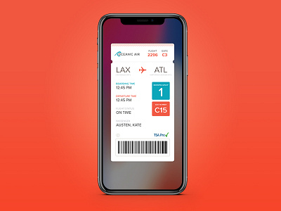
#DailyUI Day 024 Boarding Pass
Took a little break from the challenge last week. So I'm back at it today.
The two things I check most on my mobile boarding pass is my boarding group and my seat number so I wanted to give those two items prominence in the UI, which I did by making them large and putting them in the colored boxes. Different colors for different purposes. The boarding time heading matches the color of the boarding group and the departure time heading matches the color of the seat number. Matching the colors is an indicator that those items are related.
More by Amy Lyons View profile
Like

