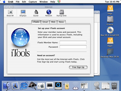
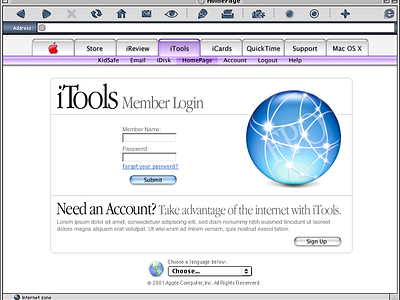
iTools/.Mac login
Designing the first login screen for what was then called iTools was an incredible experience, one that allowed me to contribute to the foundational elements of Apple's cloud services. The challenge was to create a gateway that was not just functional but also embodied the Apple ethos of simplicity, elegance, and intuitiveness. I remember the meticulous attention we paid to every detail, from the weighting of the elements to the balance of the layout.
One of the subtle but impactful design choices was the incorporation of a thin grey line, a design element that would later become a recurring motif in various Apple experiences. This line served multiple purposes. Visually, it acted as a separator, delineating the login fields from other elements on the page. But it was more than just a functional choice; it was an aesthetic decision aimed at adding a touch of sophistication to the interface. The line's grey hue was carefully selected to complement the overall color scheme, ensuring it would neither dominate the layout nor disappear into the background.
The weighting and balance of the elements were also critical. We wanted people to navigate the login screen effortlessly, instinctively knowing where to place their focus. The positioning of the text fields, buttons, and other interactive elements was carefully planned to create a visual flow that guided the user's eye naturally through the process. The end result was a login screen that was not just a gateway to Apple's cloud services but also an introduction to the company's broader design philosophy. Looking back, it's gratifying to see how those early design choices have influenced Apple's user interfaces over the years, contributing to the cohesive and user-friendly experiences that are now synonymous with the brand.
More by 🥀.fm/imagine View profile
Like


