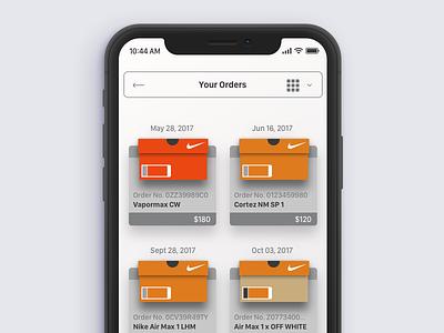
Nike orders grid view
I've been thinking about the Nike orders page in both the SNKRS and Nike Plus app for a while so used this rainy Sunday to sketch out the problems I wanted to solve and got to work. This is more than visualizing the orders with custom sneaker boxes.
1. The user can now choose between a grid and list view, with the grid view delivering more purchased items per default screen real estate than both of the current apps.
2. In the current app the name, potentially what a customer might use to best remember what the order is isn't present at the top level orders page, this solves that by adding the name of the sneaker purchased in each card.
3. Simply adding "your" before "orders" now makes the title more personalized for the user. There is still room for further personalization but the longer title would need to be stressed tested.
4. The current apps offer no way to differentiate special orders or releases from other general releases or "GR's" and is just a flat, grey generic box. I've attempted to make the user's purchases more memorable and help with the mental association of their physical collection by adding colored boxes that not only match Nike's colors but that use some of their different release boxes as well.
I think this will have a deeper psychological effect in associating orange and warm greys with Nike's brand colors.
The boxes can be styled further but I'm worried about cognitive load and how busy this view already is. it's one of those unknown's I'd have to create various states for and conduct an actual usability test against users basic job stories and jobs to be done when accessing their Nike orders page.

