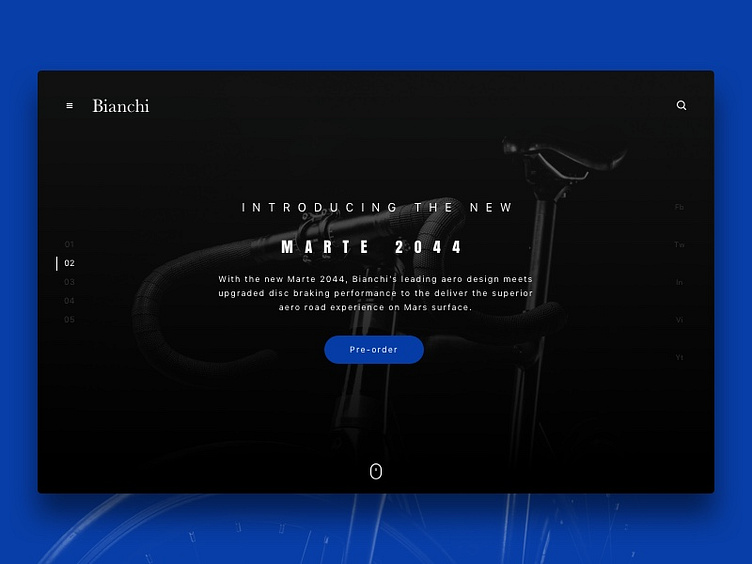
2044 – Binachi
I started a series of weekly ui/branding challenges to stretch some muscles. I will mainly focus on landing pages of known-brands and create some concepts to experiment with the user interface and web layouts.
The first one: Bianchi!
I visited recently their website and it feels quite old to me. Especially, for a popular and long-established bicycle company. I kept the same landing elements and removed some to make it more simply impactful.
What do you think about the layout?
Here is the current website if you would like to have a look:
🚲
More by Ozan Korkut View profile
Like
