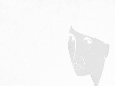
Old & New 01
Working on my Old & New sub and need a little feedback:
As usual I did this piece with the original size in mind and realize that when sized down to 960px for O&N i may lose a lot of the details.
This screenshot is actual size that will be displayed on Old & New... are the details in the face clear enough? Should I simplify the features so it displays better at this size? Or should I go with my gut and large prints in mind?
More by Troy DeShano View profile
Like
