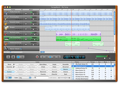
GarageBand (iLife '04)
When we were working on GarageBand, one of our major challenges was to transform Logic Pro, a professional-grade music production software, into a consumer-friendly application. Logic Pro was incredibly powerful but also complex, and our goal was to make music creation accessible to everyone. This was a monumental task that required us to rethink and simplify the user interface without sacrificing the core functionalities that made Logic Pro so versatile.
The wood finish in GarageBand was a key element in this transformation. It wasn't just a stylistic choice; it was a strategic decision to make people feel like they were in a real-world music studio. We invested an enormous amount of time in getting the texture, shading, and lighting just right. The wood grain, the warm hues, and the tactile feel of the controls were all meticulously crafted to offer a sense of familiarity and comfort. This was essential in making a professional-grade tool feel approachable to everyday users.
But the work didn't stop at the visuals. We had to ensure that the controls not only looked real but also behaved realistically. When you adjusted a knob or slider in GarageBand, the experience was designed to mimic the tactile feedback you'd get from actual studio equipment. This was a crucial part of translating the complexity of Logic Pro into the consumer-friendly interface of GarageBand. By incorporating skeuomorphic design elements that felt intuitive and natural, we were able to make advanced music production features accessible to a broader audience. This wasn't just about aesthetics; it was a functional choice aimed at breaking down barriers to creativity. The level of detail and polish that went into GarageBand was a testament to our belief that good design can make technology an extension of human experience, rather than an obstacle to it.
More by 🥀.fm/imagine View profile
Like


