Grid Friday 4 | tt logo with simple geometric grid ( for sale )
Hey guys,
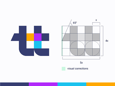
I've decided to bring back my weekly Grid Friday shots where I share the grids I use for my logos and some tips that can help you with your logo design process.
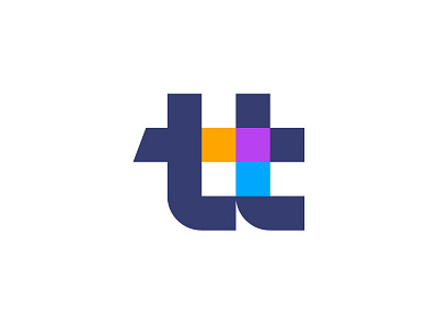
Here is a tt monogram I did about 1 year ago for a training consulting company, called teamtime. The concept represent 2 connected t letters and hidden colorful arrow, that symbolize collaboration and growth. After using a simple geometric grid, the icon felt that needs some more balance, so I did the left part little longer (visual correction with green color on shot).
Always happy to hear your feedback!