AFA Studios- Branding
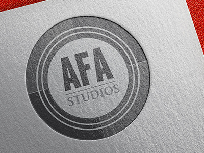
I had the pleasure of building a brand for AFA Studios in 2013, who has since closed it's doors. AFA Studios makes meaningful media. The logo reflects this in its concentric circles growing ever closer to its goal, coming to the centre or the core of the issue along with the directional lines drawing in towards the target. The imagery reminds the viewer of a film camera lens as well as the opening credit countdown to a film. The typography is solid and grounded portraying an ethical stance that is unwavering in its dedication. The ‘AFA’ is shown rising slightly above the midpoint signifying how the group is determined to rise above the crowd into the realm of meaningful media. The design allows for a variety of uses while maintaining its integrity and visual impact. It is easy to view in a small format such as on poster designs and iPhone media. It’s classic look will endure as AFA grows and matures.
The logo is minimalistic in design but invites the viewer to look deeper and see the layers of meaning just as AFA Studios is about entertainment but with a deeper meaning behind every production.
