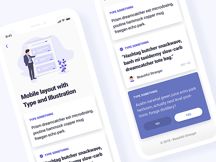
mobile type practice
always trying to improve my typography! especially on small screens where finding the right reading size can be tricky. Here's more practice with my pointless card UI, using an 8px soft grid to establish some padding rules. All type set in roboto - so it will look good on android too ;) illustration from https://undraw.co/illustrations
More by Chris Withers View profile
Like

