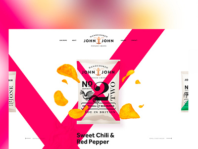
John&John Potato Crisps
Redesign of the John & John's website.
Their brand identity is superb, but their website does not follow this trend. So I tried to adapt the website according to their new visual identity.
What do you think guys?
More by Vianney Tribolet View profile
Like


