This is for That Logo 3
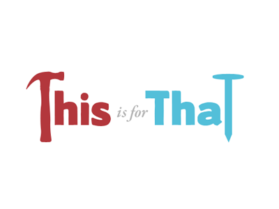
Decided that the arrows were superfluous and far too busy and blunt for a logo. No arrows meant that the layout could change to in-line which increases readability and balance. I've worked pretty heavily with the type. Layout > modify > print out > cut out > scan > create new forms > re-layout > still not happy with them. This is not the final version.