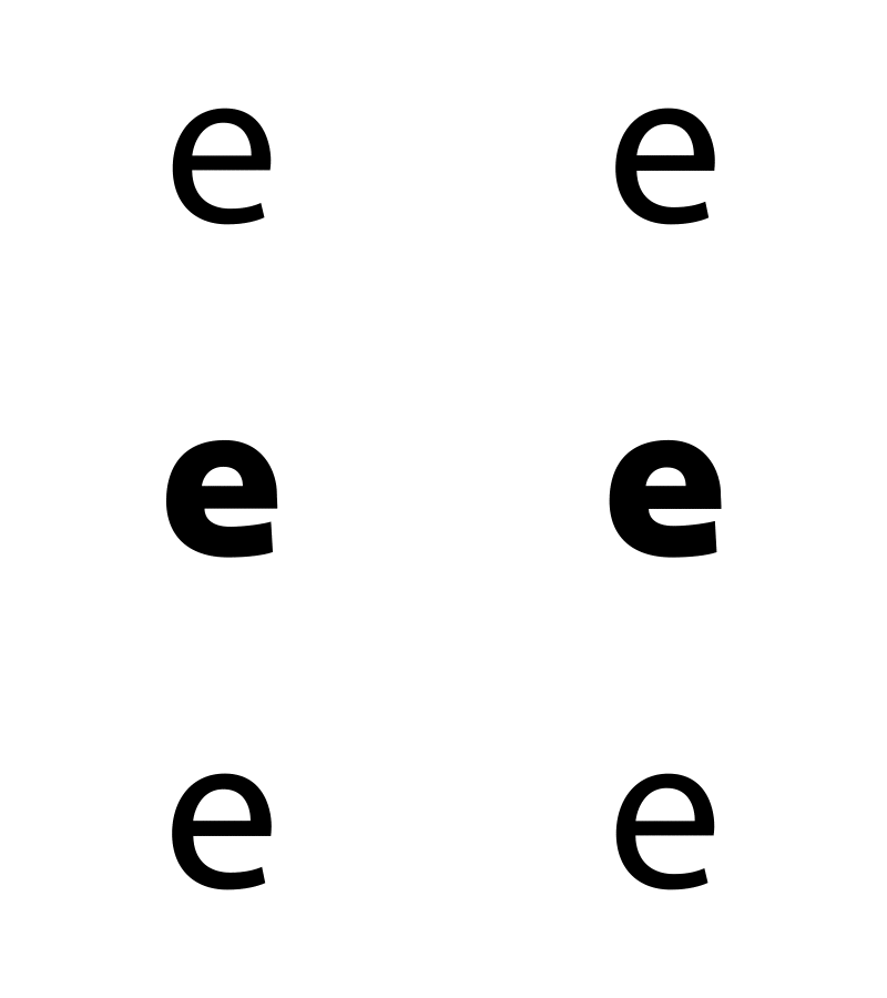
Oculus Go UI - hover over
When I was working on the visual design for the Oculus Go, the Lead UX Designer (Chris Nesladek) let me get OCD in details like this... I thought the hover over would look nice if it animated into the bold version of the typeface (Oculus Sans) instead of a trick hard cut. There's something pretty about making the narrative of UI continuous. It lets the user be aware of their journey, especially in a new system like VR.
More by Eli Guerron View profile
Like
