Thirty Logos Design Challenge #10 - Anchor
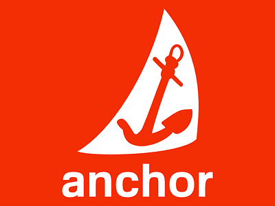
This logo is for a nautical clothing line. The two main requirements were having an anchor shape and NOT using the color blue. Also, "Many of our products are actually produced with recycled boat sail material."
I wanted to have more than just an anchor in this logo and I wanted to incorporate a sail because that ties into the uniqueness of this "company's" product line.
More by Brandon Jacobs View profile
Like
