Subscription UX
Hey, Dribbblers 👋
Subscription UX ...!
Your Subscribe button should be easily visible and distinct. You don’t just want to squeeze it amongst a bunch of other links or make it look like another one of the pop-up ads on your app. For a subscription service, this call-to-action is the single most important button.
Your subscription process should not take more than a couple of clicks. It’s a good idea to have the “Subscribe” button visible at all times or, at least, easily accessible from the header or footer.
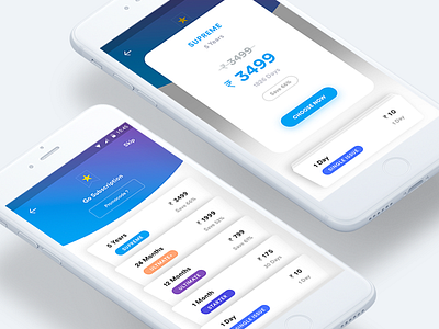
You should always have at least 3 to 4 different subscription options. They could be in terms of period (monthly/yearly), content (everything/somethings) or pricing tiers based on type of customer (adults/students).
It’s also good to have discounts for signing up longer-term or paying upfront. That incentivizes your customers to make a bigger commitment than they might otherwise. A great subscription experience cannot be designed without a great experience leading up to it.
Keep thinking about how you can improve your subscription service. Perhaps you can provide better ways to navigate the content you offer.
What do you guys think about the overall look and feel?
Let me know your thoughts!
Follow me on:
www.uxdtechnologies.com
https://medium.com/@dhipumathew
https://www.linkedin.com/in/dhipumathew/
https://www.facebook.com/uxdtechnologies/
https://www.linkedin.com/company/uxdtechnologies/
https://www.instagram.com/uxdtechnologies/
