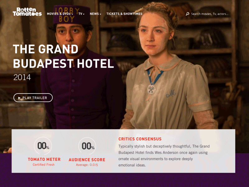
Thirty UI #5 - Movie Page
This is my fifth shot for the Thirty UI Challenge.
The prompt was to modernize the Rotten Tomatoes website, specifically by giving it a full width header and focusing more on each individual movie rather than everything that's at the box office. The prompt calls for an "exciting, bold, and clean modern experience."
I also set out to draw the users' attention primarily to the film's ratings as the page loads, since ratings are the primary value of a Rotten Tomatoes page.
I admittedly didn't go into all the details that a Rotten Tomatoes page should shave. Been really pressed for time and wanted to keep making progress on this challenge. Wouldn't have the hero transition so quickly on a real page, but it works well for the sake of the shot here.
Let me know what you think!


