Logo design challenge #28 - TXT
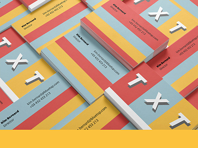
Mockup for TXT's business cards.
Today's brief was for an app that makes communication within a company easier. The app is installed in the company's sub-domain so that employees can discuss private information with each other, make brainstorming for new projects, give anonymous feedback on company's decisions, and make personalised calendars with each one's tasks.
The brief indicated that the logo and colour palette needed to be bold, easy to read and memorable.
I used the primary colours (with a slight variation in the value so that they're not too bright) for the palette in order to convey the ease and accessibility that the app offers.
The name of the app (TXT) is in block letters with a drop shadow, making it very easy to read and memorable. I compartmentalised each letter to graphically represent the compartmentalisation that the app offers: calendars, feedback, discussions and brainstorming all next to each other and easily accesible.
