Cafe Wrren
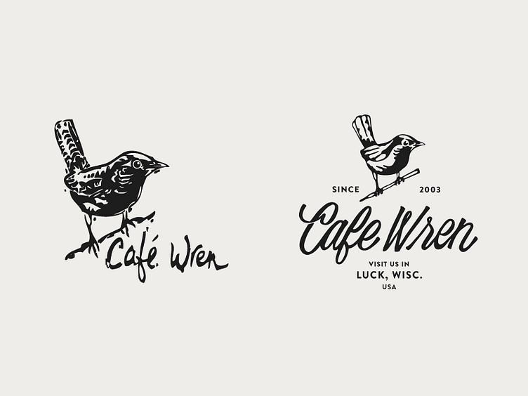
In the middle of a fun brand refresh for Cafe Wren in northern Wisconsin. On the left is the original logo, and the right is one of the in progress proposed directions. A few things that were discovered early on were: 1 - the desire to create a unique logotype that would be the focal point, rather than the wren and, 2 - the desire to have at least one option that keeps a refreshed version of the original wren illustration. Cleaned it up a bit for this one and I'm liking how its shaping up!
More by Whitney Anderson View profile
Like
