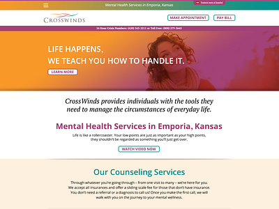
Crosswinds Mock-up
Below is a design test for a local small web studio. The fictional client was a mental health services in Emporia, KS. The content was provided too. I was going for bright colors without being too perfect in regards to the images. Which is why I went with the gradient overlays. (Never heard any feedback, even after several attempts at contacting them).
See full mock-up here:
More by Todd Lubacz View profile
Like
