Re-imagining a Mobile Boarding Pass

I decided to give InVision Studio a try over the weekend - and had a go at trying to rethink the way mobile boarding passes are designed.
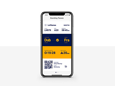
My aim was to group the information into clear sections, making it easier to read and make a mobile boarding pass more user friendly, and not just a mobile version of a boarding pass - more details around my thinking are in the attachment.
Props to @InVision - Studio was super simple to use, and I even started dabbling with some animations - specifically around the flight status section - I might post a screencast with some of the animations as a follow-up.
Font used: Inter UI