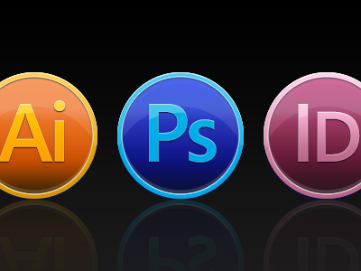
CS6 Icons
Yet another take on the CS6 icons, bouncing off the circular designs, and the official two-tone/border icon.
I like how the circular icons are popular in OS X Lion, so there's a consistency thing going on here. Ironically this is very similar to the Lightroom app icon (I realised this after I had done these).
BTW, the font is not the official 'Adobe Clean', which is why the type looks off here.
More by Robert Cooper View profile
Like

