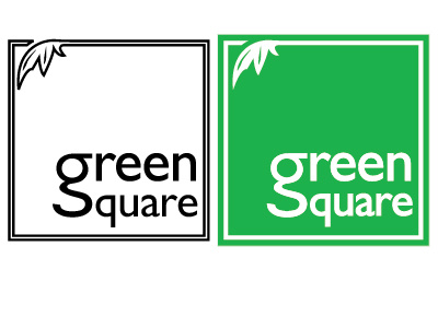
Green Square logo design
This is an old student project I thought I would share. The brief was to design a logo around two contradictory terms - in this case urban garden centre.
At the time I was pretty pleased with myself for finding the 's' in the tail of the 'g'. Looking back, the line work on the reversed out version is a bit too heavy - at this size, at least.
More by Andy Owen View profile
Like
