Back in Black
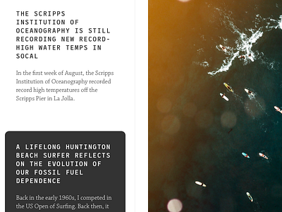
Working with a new layout for the blog. As I continue to re-evaluate things about my life and work (and its resulting output), I think perhaps I can be better about keeping the two in sync.
I've been working a lot with monospace typefaces, incorporating them in different ways while maintaining readability. Also working a lot in the micro-sense of digital web design, assessing how to create a more natural flow for the content and type across various displays, and thinking about how the design wraps around that instead of pouring the type straight into pre-defined boxes.
Notes:
Test copy from The Inertia
Typefaces: League Mono from Tyler Finck, and Chaparral Pro
More by jonny gotham / jonathan lu View profile
Like
