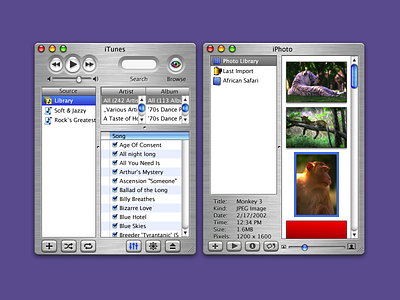
Apple iLife ecosystem media inspector(s) (circa 2004)
Design Process:
The design process began with a thorough research and user testing phase to understand the pain points and frustrations users currently faced when managing their media files. The research helped me to identify key areas that needed improvement in the current media management process.
I then moved on to designing the media inspector, focusing on creating a user-friendly interface that was easy to navigate and understand. The inspector was designed to be contextually aware, which meant that it would automatically change its layout and functionality depending on the app it was being used in.
Efficiency was also a key consideration in the design process, as the team wanted to ensure that users could quickly and easily access and organize their media files. This included the integration of powerful search and filtering tools, as well as the ability to drag and drop media files between apps.
One of the most significant challenges faced during the design process was ensuring that the media inspector worked seamlessly across all apps. I had to work closely with the developers of each app to ensure that the inspector integrated smoothly and that there were no compatibility issues.
Outcome:
The universal media inspector was well-received by people, who appreciated its ease-of-use and seamless integration between apps. The inspector was also efficient, with powerful search and filtering tools that made it easy for people to find the media files they needed.
The inspector received positive feedback from users, who praised its familiar interface and its ability to work seamlessly across all apps. The inspector also received recognition from industry experts and was awarded several design awards.
Overall, the universal media inspector was a significant step forward in improving the media management experience for users. It served as a model for other companies to follow when designing similar tools and became a standard in the MacOS X and iLife integration.


