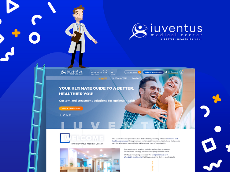
Redesign for Iuventus Medical Center
We’ve been recently hired to redesign a corporate website for the Iuventus medical center 🗜 . Its unattractive visual appearance was one of the main problems resulting in low traffic and loss of customers. To make things better, we have provided them with a complete website redesign. The new design and content have already improved visibility and attracted more potential clients. Also, we’ve added isometric vector icons to draw clients’ attention to website sections. And what do you think about this project, guys? Click on expanded version: Behance BE ONE STEP AHEAD P.S. Don't forget to press L and Follow to keep up with new stuff! ✌️
More by Semalt View profile
Like
