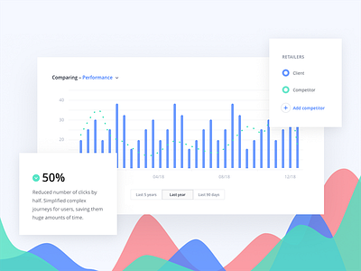
Data visualisation graph
Being mindful of how people use a product is the best way to improve on the next iteration. We looked at how users were using the current product and changed the design to better suit their needs.
Simplifying the UI for this market research tool helped reduce the user click rate by 50%. Not a bad way to increase productivity (and reduce frustration) further! 🔥
More by Caboodle Studio View profile
Like
