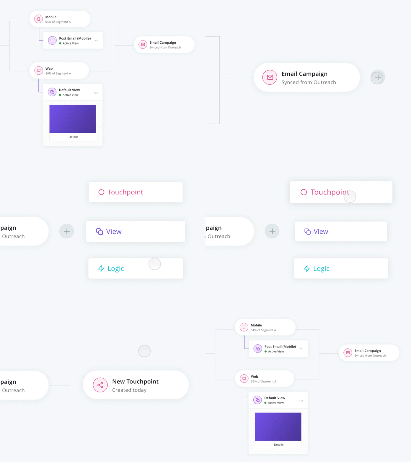
Journey Map | Microinteraction Exploration
Here's a microinteraction I've been working through for a journey map product for one of our clients. My goal was to create a motion language that felt energetic and slightly playful, something atypical for a product in this space.
When I work on explorations like this I first start with lo-fi motion mockups to ensure I'm hyper focused on how elements are moving, absent of content. Once that feels good, I'll remake it in a hi-fi state, including things like text, icons, images, etc.
For those of you who are new to motion, or are just curious about my process, I've attached the Principle files for both lo-fi and hi-fi versions of this post. Hope it’s helpful!
More by Termini Design View profile
Like
