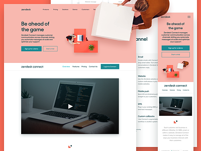
Zendesk Connect redesign
We recently got a chance to redesign the Zendesk Connect page, with the help of the amazing Lauren Bernal on copy. Trying something different below than my usual malarky, and will explain some of the thought processes we had with the redesign.
----
On rare occasions, I need to put the liquify tool down to work on solving different design problems.
For this redesigned page, one of our primary goals was to showcase our product in a clear and non-obtrusive way for people to absorb. As a small copy + designer team, we worked directly with the creators, PMs and product designers of the Connect team to create abstractions of the product, without accidentally creating new features (yikes). Although we are happy with how these came out, we're always looking for ways to improve this, and this will be top of mind for all of our Zendesk projects moving forward.
We also worked with the web team extensively to make sure they had what they needed (a smoooove handoff, interactive prototypes, etc.). They had mentioned that a heavy site was always in their peripherals, so we made small tweaks like masking out the assets so the page would load ever-so-quicker.
Hope this quick snapshot of how our process is, was useful. Let us know what you think!
Check out the page here:
http://zendesk.com/connect
We are also hiring producers and motion designers. Hit me up!


