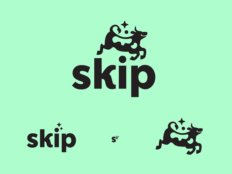
Skip - Another Logo Concept
Another concept we dropped early on for Skip, because it felt too sleepy. It looked heavy, or like it belonged on an ice cream tub. More dreamy whimsical than what the Skip self checkout brand required. Checking yourself out in a store should feel fast and lively, not drowsy and relaxing. so we canned it quick. But still a cute cow!
More by Hoodzpah View profile
Like
