Span Chart

Here's a snapshot of Span Chart from my recent project "Your guide to Data Visualization". Check out the complete project on Medium and Behance.
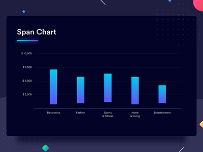
Span charts allow us to draw a comparison between ranges of data. Categories that span across a range of values instead of a specific value can be compared with the help of span charts. To represent the range the maximum and minimum values are plotted against the Y-axis. The space between these values is covered with a solid color denoting the span of the category. Visually, this might look a lot like a waterfall chart, but they are not at all similar in terms of functionality. Span charts can be drawn vertically or horizontally, whichever is convenient. Well, enough of the theory, check out the example below and it should clear any doubts that you might have.
The graph shows the price range of various categories (electronics, fashion, sports, etc) available on an e-commerce platform. Because we're comparing ranges of price, it's obvious that nothing is sold for $0, which is why most of the bars don't touch the X-axis.
Best Practices for Span Chart
1. Pick the scale for the value axis cautiously. It's important that the data is represented in the maximum size possible allowing the user to read it with more accuracy.