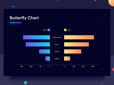
Butterfly Chart
Here's a snapshot of Butterfly Chart from my recent project "Your guide to Data Visualization". Check out the complete project on Medium and Behance.
Butterfly chart is also known as Tornado chart. It’s called so because of the shape it takes. Butterfly chart is like two bar charts compared to each other representing comparison of two data series. It allows comparison between two groups on the basis of multiple categories side by side. If it sounds too complicated, have a look at the example here. This chart is very commonly used to compare teams and sportsmen during sports match telecasts. The variable under comparison remains the same for all the categories here.
The example above draws a comparison between the traffic on a website in 2016 and 2017 (groups) from all the channels — Social media, direct, search and others (categories). In this case, the variable under comparison is the number of visitors. The graph also appears somewhat like a butterfly, each side making one wing of the butterfly.
Best Practices for Butterfly Chart
1. Plot the bars horizontally as it allows you to accommodate a lot of categories for each group
2. Show the scale on both sides of the graph so that the user can determine the value of the bars easily

