Pricing Page Illustrations Story
I adore how these illustrations came together. So much so that I felt it needed a BTS share as to how we got here:
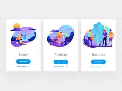
Starting off, we began with your standard illustrations for a pricing page. 3 items, in larger size progressing as the plans increased in offering. Buildings were deemed too "corporate" since NPO's (nonprofit organizations) generally avoid being coined as corporations in the charity space. That then led us into this idea of starting off with a lemonade stand and progressing into more formal organization views (small shop, larger office, etc). The fear then was that for our Starter plans that could downplay what they do and the level at which they run their organization.
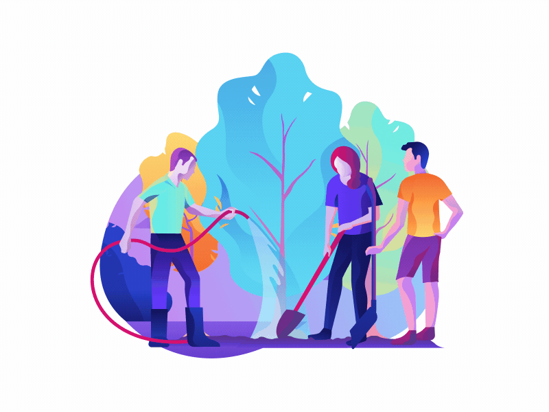
By almost a stroke of luck while brainstorming with the team, we reviewed some old sketches of one of our homepage hero concepts of a local park cleanup and the light bulb went off. This execution of a person planting a small tree by himself, and then progressing by having more and more assistance was a perfect analogy for how people use Crowdrise. We essentially have 3 ways of fundraising: individuals, teams, and events/charities. This embodied the way we view our tool and offered a great way to tell a story solely through imagery.