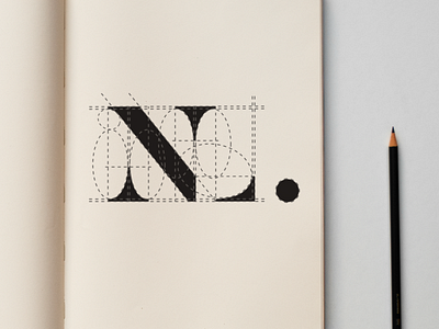
N+L Monogram Gridding
Refinement of N+L monogram. As I'm just starting to learn about brand identity, I try my best to imbue my logo designs with logic, which means that I strive to avoid random design decisions that don't have any bearing to any other part of the composition. I see to it that every angle, point, line, and curve aligns with another element in the design. I'm not sure if I did it perfectly here, but I'm quite happy with the result.
More by Newton Llorente View profile
Like
