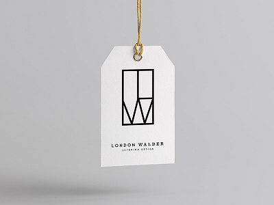
London Walder Interior Design
An identity project in the works for an interior design client. the "L" & "W" sit within a rectangular container, emulating mid-century and prairie style aesthetic, but done so in a thinned, minimalist and modern way. We also explored the juxtaposition of a sans serif and serif font in the logotype.
More by Malt View profile
Like

