Harbor Logo
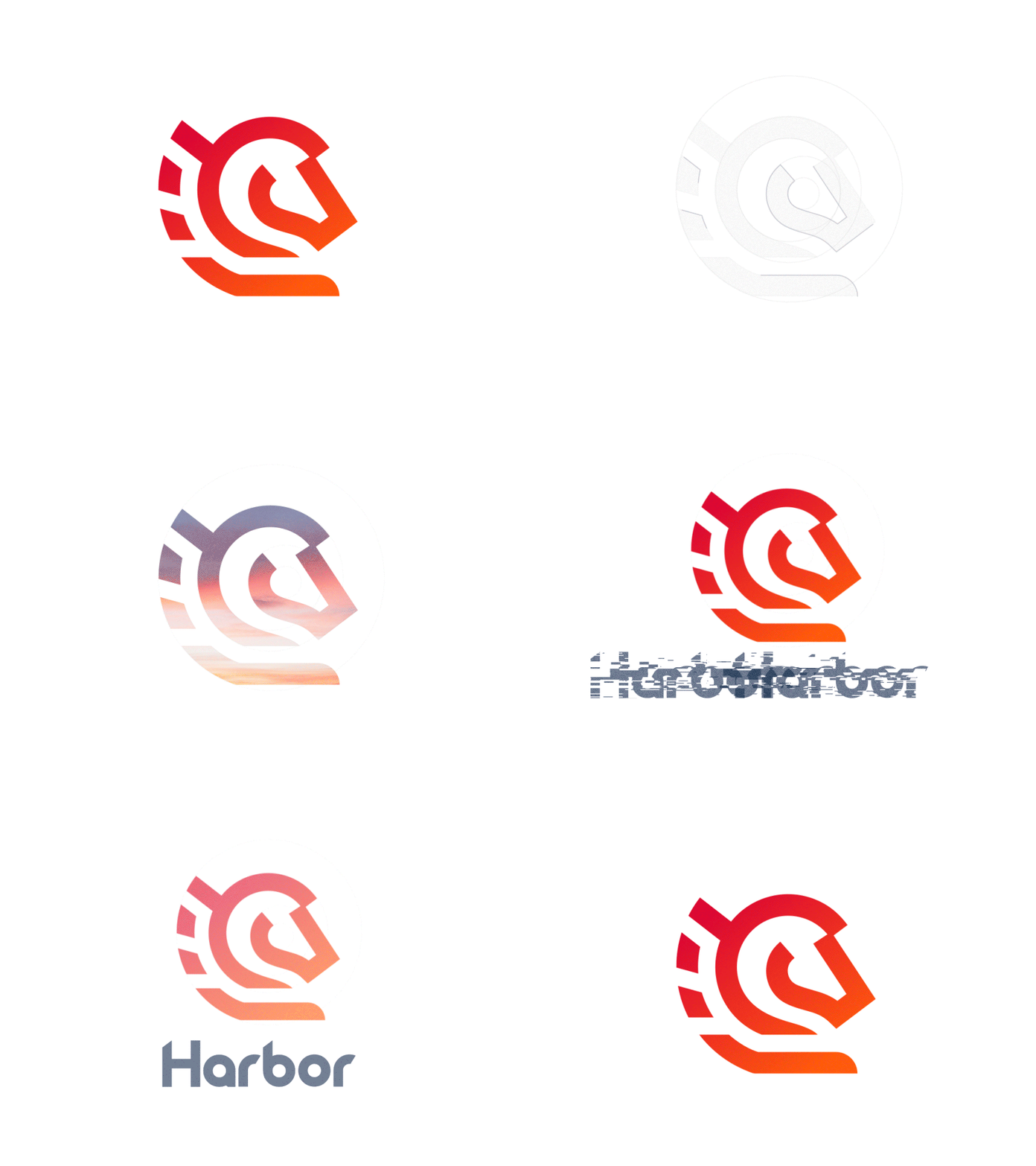
So, here goes a logo with some line work and color inspiration animated. As a major symbols for the signet I chose Pegasus representing swiftness, mobility and strenght. As for the second major symbol I chose chess figure that stands for logistics, planning ahead and inteligent choices. Colors are those of a rising sun, again , hope you like it! To be continued. ;)
More by Tomasz Nadratowski View profile
Like
