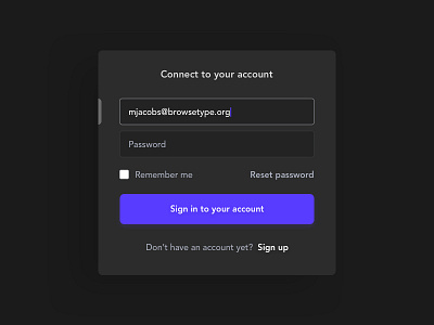
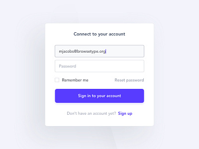
Sign In / Connect screen Black Version
Hey !
I wanted to try a dark version of the login component and added a vertical marker on the left to make the focused input more visible to the user.
Press L to spread some ❤️ and don't hesitate to give me your opinion about this one ;)
More by Arnaud Mazé View profile
Like

