Kwiek
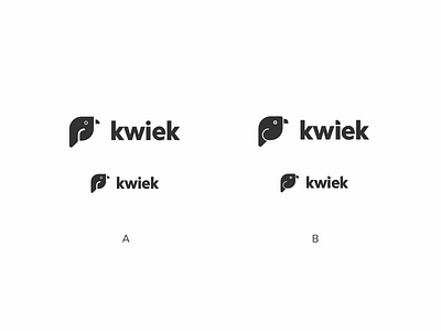
Hey guys, thank you for viewing my shot. I created these two variations of a logo and I want to hear from you: what do you see and which one do you like more.
This logo is for a website which will be targeting an audience with ages beginning at 55 years. The website will help their audience in preparing their home for the future, in which they might need help to remain independent and safe in and around their home.
Please do tell me, what do you see and which one do you like more: A or B.
Thank you for your time and have a awesome day
Edit: I reuploaded it because I saw a small fault in the design. Sorry, and it's been taken care of.
More by woui View profile
Like
