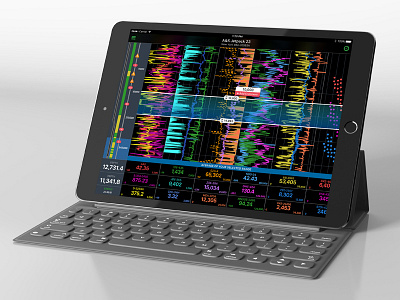
Advanced Data Visualization Live Charts
This is a project under NDA (with data wiped out) on a heavy data visualization of live monitoring. Each data cell below the graph can be customized to the data point you want to see, each graphical can be chosen between line, dotted, spotted and weights/colors are customizable.
Data feeds into the dashboard and output the layout in both ipad, iphone, and windows desktop applications. Functionality includes pinching and zooming in, stopping the graph and highlighting an area to apply calculations in the data range, the ability to comment on a certain area, overlay graphical lines for comparison.
Colors of the lines need to be open and expansive for any user that want to customize their own streams. Color palette needs to also work well in both dark and light modes of the app, so we can't limit the coloring of how the lines will appear.
This is not a prototype or a fun experimental ui. This is the end product with continuous updates to features.
8 months in development and design.


