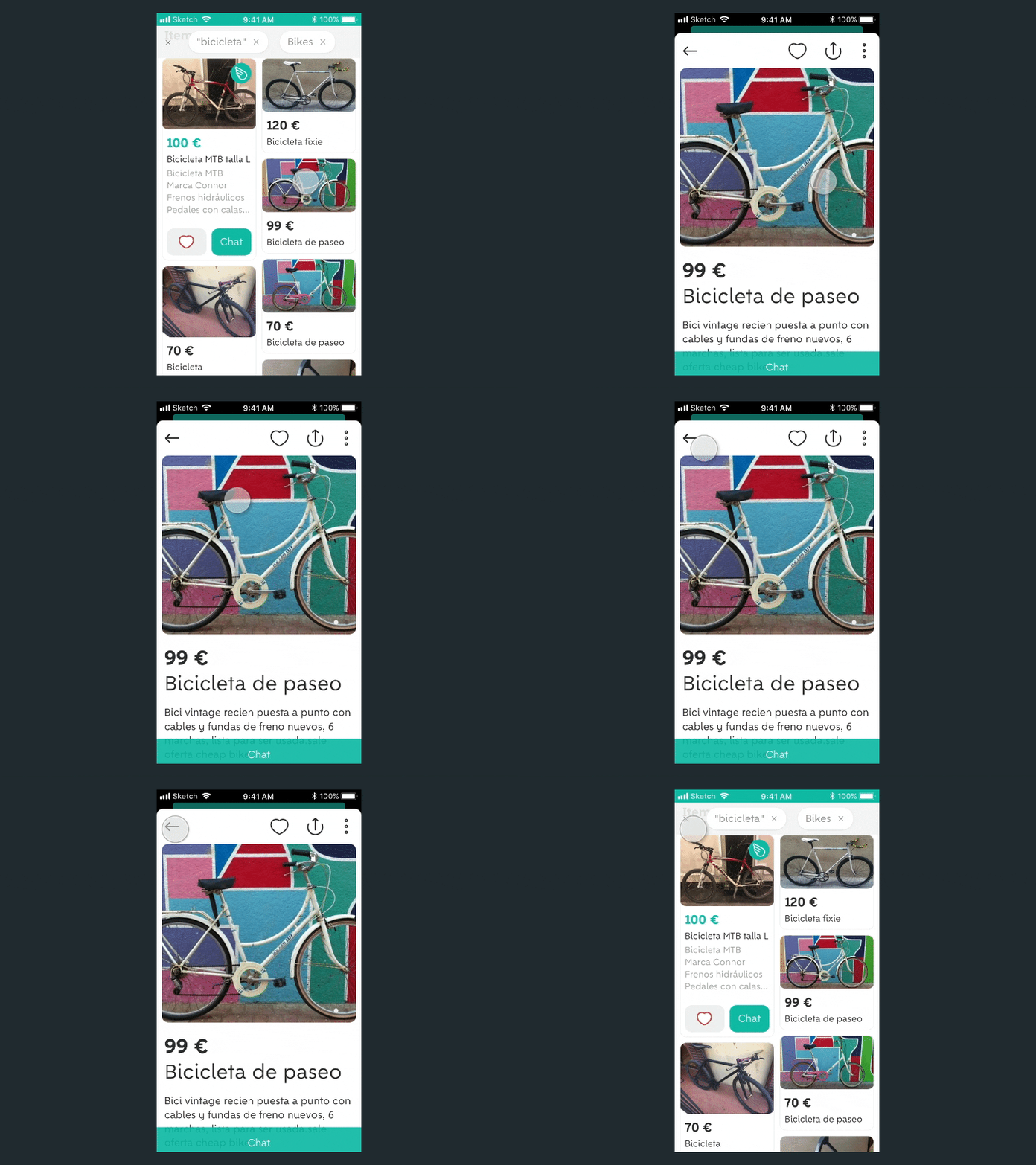
Wallapop card transition
If it looks like a card, it should behave like one too.
@wallapop is a virtual market place from Spain. While using it I found a little detail that really bugged me: items are displayed like cards and their detail view is styled like a card too. But it doesn't behave like one and the transition is a normal right to left transition (see here). This is my take on the transition.
(I know that the back arrow in the card overlay should point down)
More by Jonas Hoffmann View profile
Like
