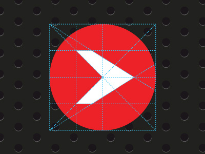
Evolve Church Logo Grid
Took the time to make our mark mathematically correct and symmetrical.
Lesson learned: As it turns out, the arrow looks completely off and I had to nudge it to the right a few steps to make it look visually even. Even the most perfect grid can lead you wrong, so you have to make the decision that's best for the project.
More by David Hemphill View profile
Like
