Zedelgem Logo
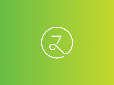
Next to the typographical logo I also created this 'Z' which we use as an extra brand asset. The circle symbolises the unity between the town and his social services (which where separate organisations that join forces from now on). I'll upload some use cases of the two logo's soon! :)