Henry's Honey Label
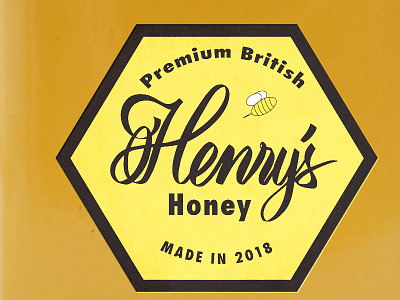
For this project I wanted to keep the label design modern and have a custom feel to it. The main focus was to keep the script of the company name legible. There were many iterations that I went through to achieve a nice and smooth flow.
Color choices were to keep it congruent with the colors we are familiar with honey and bees. Also the colors will help the product stand out on the shelves compared to other products.
