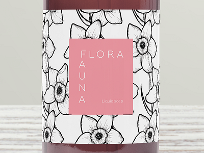
F&F Cosmetics Label
Label/packaging design for a cosmetics brand that utilizes Greek flora as the inspiration for their ingredients. The brand puts emphasis on fresh, organic ingredients that are meant to make the user feel beautiful. Being that there is a large emphasis on the floral, I took their name and their concept a bit literal with the illustration on the label. The illustration itself utilizes a pattern created with 1 type of flower, the Narcissus type. The story of Narcissus is a common one, of a man so self-absorbed and arrogant that he drowned while staring at his reflection in water because he fell in love with it; from this, a beautiful, delicate flower grew. Because the Narcissus flower is associated with beauty and delicacy, I thought it fitting to use it in a brand of a product meant to make us all feel beautiful. The colors are chosen specifically for each product, white for the shampoo's clean sensation on the scalp, a creamy peach orange to emphasize the softness the lotion itself would provide our skin, and a light pink for the liquid soap as a way to show the scents.
