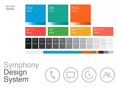
Cisco Symphony Design System
One of the first steps in this process was to conduct extensive research and analysis of current market trends and customer needs. This included gathering data on people behavior, preferences, and pain points, as well as studying the design approaches of Cisco competitors.
Through this research, we identified several key areas of focus for the design of Cisco new endpoint systems. These included ease of use, intuitive navigation, and a modern, visually appealing aesthetic.
To achieve these goals, we developed a comprehensive design system that included a set of visual guidelines, brand standards, and interface elements. These guidelines provided clear direction for the look and feel of Cisco endpoint systems, and ensured consistency across all touchpoints.
The UI elements we created included icons, buttons, and other interactive elements that were designed to be intuitive and easy to use. We also focused on creating a cohesive visual language that would be consistent across all of Cisco endpoint systems.
In addition to these visual elements, we also developed a set of design principles that would guide Cisco design decisions moving forward. These principles included a focus on simplicity, functionality, and accessibility.
Throughout the design process, we worked closely with a cross-functional team of engineers, product managers, and experience designers to ensure that Cisco designs were both visually appealing and functional. We also conducted extensive people testing to validate Cisco design decisions and gather feedback from real people.
The result of Cisco efforts was a set of visually appealing and intuitive endpoint systems that were well-received by both customers and internal stakeholders. The success of this project has solidified Cisco position as a leader in the endpoint systems market, and we look forward to continuing to innovate and improve Cisco designs in the future.


